
The Shoe Box: Logo Redesign & Branding
This week, I challenged myself to find and redesign an old logo from my hometown. Thanks to some newspaper archiving magic, I browsed through a few 1950s Lakeland Ledger ads before finding one.
This logo stood out because it was already pretty stinkin' cute. From the bow on the icon, I got the sense that this was a luxury store where you'd be waited on hand and foot. (Or maybe just foot.) I focused on that positioning for an updated logo that feels feminine and expensive.

While trying out different ideas, I couldn't help but wonder if my version was better than the original. I'm sure this logo was very stylish back in its day. Let me know what you think!


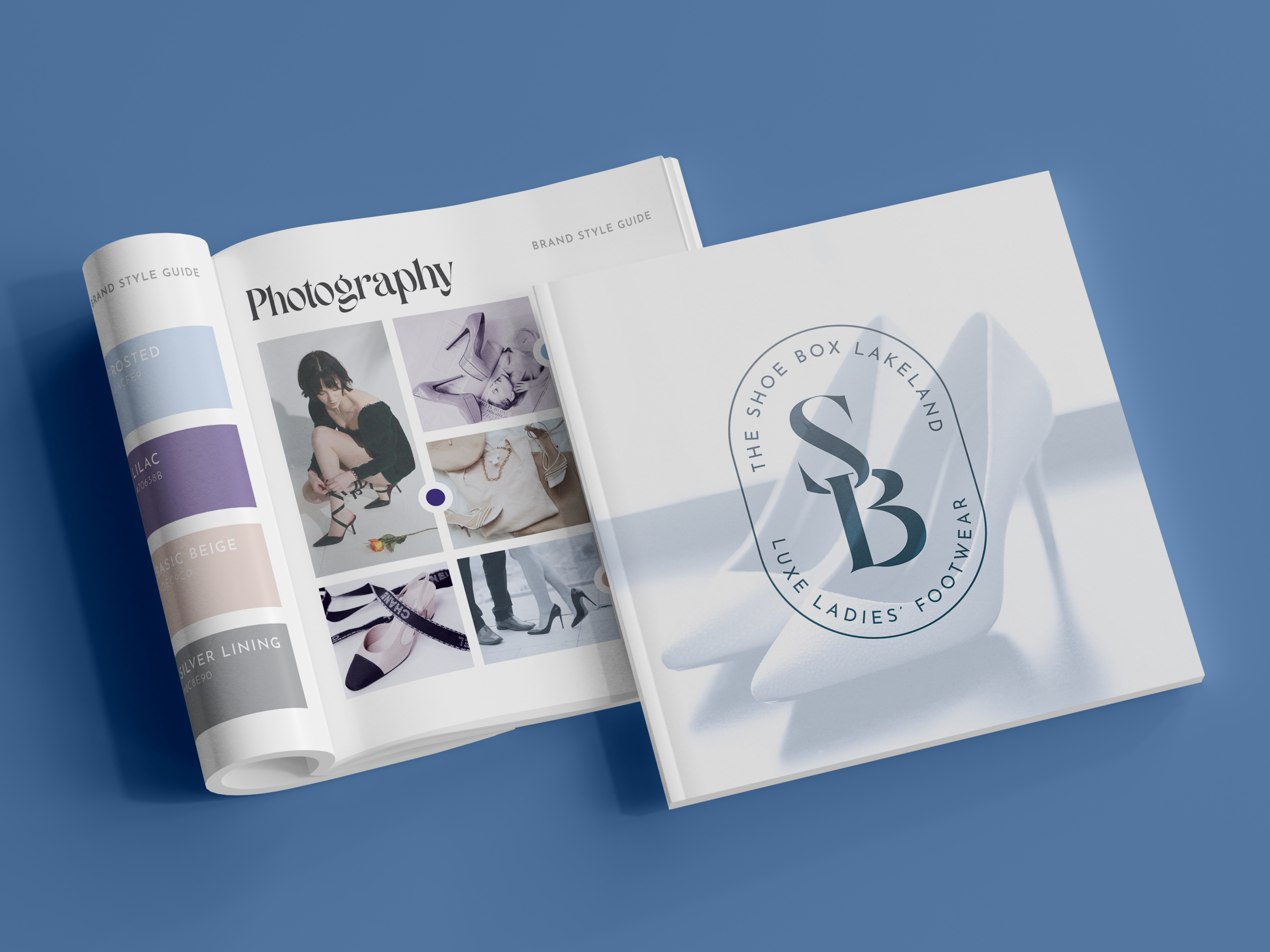
Here's a quick branding guide for The Shoe Box. Putting together an identity like this really helps you see what you might be missing.
In this case, I experimented with making dissimilar photos feel cohesive with color overlays. I also realized the brand could use some neutrals, leading to a new beige and gray in the color palette. These changes wouldn't have been obvious to me before, which is why playing around with the brand this way can be so revealing.


A little branding in action for The Shoe Box. A luxury brand likes this requires just the right mix of simplicity and attention to detail. As with a lot of things in life, you've gotta work hard to make it look easy.


Adapted from my Instagram account.